Hello everyone,
So as part of project I have been creating fabric designs and for this section my final outcome was to make 6 final fabric designs. As seen in my last post I did lots of differnt development and experiments to create my 6 final fabics. for each of these fabics I had to use differnt techniques and differnt patterns for each.
Ror my first pattern I used heat transfer paints to create this fabric. I chose to transfer the paints onto leaves and then transfer this onto the fabic. I have experimented with using differnt colours for the background as I felt that it needed a background to stand out more. I chose to use yellow for the background colour. After I had transfered the laeves and the background I wanted to see if I thought that sewing over the top would make it stand out. To do this I photocoppied the fabric and drew and sewed over the top. I decided not to do this on my final fabric as I thought it distracted from the design.


This is my final fabric design, I really like how this has turned out as i think that the design and the colours work well together making it stand out. I dont like how the leaves have printed with some white marks, I think this has happened because the leaves still had moisture in them so they could not transfer flat.


This is how my final fabric design has turned out. I really like how the colours look together as i think the combination of analogue and complementary colours works really well. I used the bondaweb like tracing paper, I thought that this would make the pattern really easy to repeate but I actually think that this amkes the pattern too regimanted and neat which isnt the look I went for in the first pattern.


This is my finished fabic design, I dont really like how this has turned out as I feel it does not stand out as much as I would want it to. I do like how I was able to easily rotate the pattern to make it look more seemless.


So as part of project I have been creating fabric designs and for this section my final outcome was to make 6 final fabric designs. As seen in my last post I did lots of differnt development and experiments to create my 6 final fabics. for each of these fabics I had to use differnt techniques and differnt patterns for each.
Ror my first pattern I used heat transfer paints to create this fabric. I chose to transfer the paints onto leaves and then transfer this onto the fabic. I have experimented with using differnt colours for the background as I felt that it needed a background to stand out more. I chose to use yellow for the background colour. After I had transfered the laeves and the background I wanted to see if I thought that sewing over the top would make it stand out. To do this I photocoppied the fabric and drew and sewed over the top. I decided not to do this on my final fabric as I thought it distracted from the design.


For my next fabric design I chose to use bondaweb, using acrylic paint as I felt this stood out more and the colours were bolder. I tested out layering the differnt colours and how I could add a background to the design. I chose to use yellow for the background as I liked how it was a complementarty colour to the purple.


In my next finak fabric design I chose to use ink and bleach. I started off by testing the differnt ways I could apply the ink and bleach to the fabric. I tested out wetting the fabic first and then adding the bleach using a cork. I wanted to add detail over the top using free machine embroidery. I started off by just adding stitch over the top but I felt that you could not see the detail as much as I wanted. I then tried adding a translousent fabric over the top and then stitching over it. I really like how this looks as I think that it makes the stitching stand out.


This is my final fabic design using ink and bleach. I like how I was able to layer the ink and bleach over the top of eachother. I also like how the translocent fabric mutes the colours of the ink and bleach and then I have used revers applique wich then lets some of the brighter colour though.

For my next fabric I chose to use fabic paint and create a stencle to rotate and repeate the pattern easily. I tested out using differnt colours to make the pattern stand out, I wanted to use quite realistic colours so that it looked natural and like plants. I ended up chosing to use a light green for the background and a dark green for the pattern. From my tests I did before I needed to add less water to the paint so that it did not bleed into the fabric and so you could see the pattern clearer.


This is my finished fabic design, I dont really like how this has turned out as I feel it does not stand out as much as I would want it to. I do like how I was able to easily rotate the pattern to make it look more seemless.

For this fabic design I chose to use hot glue to create this pattern. I wanted to experiment with how I could make the cercals touch to create a differnt texture. When I was planning out this fabic design, I photocoppied the sample to look at the design, I really like how the photocopy looks as it flatterns out the design and makes it all part of one layer, I chose to photocopy the design and then test how I could sew over the top to add more detail.

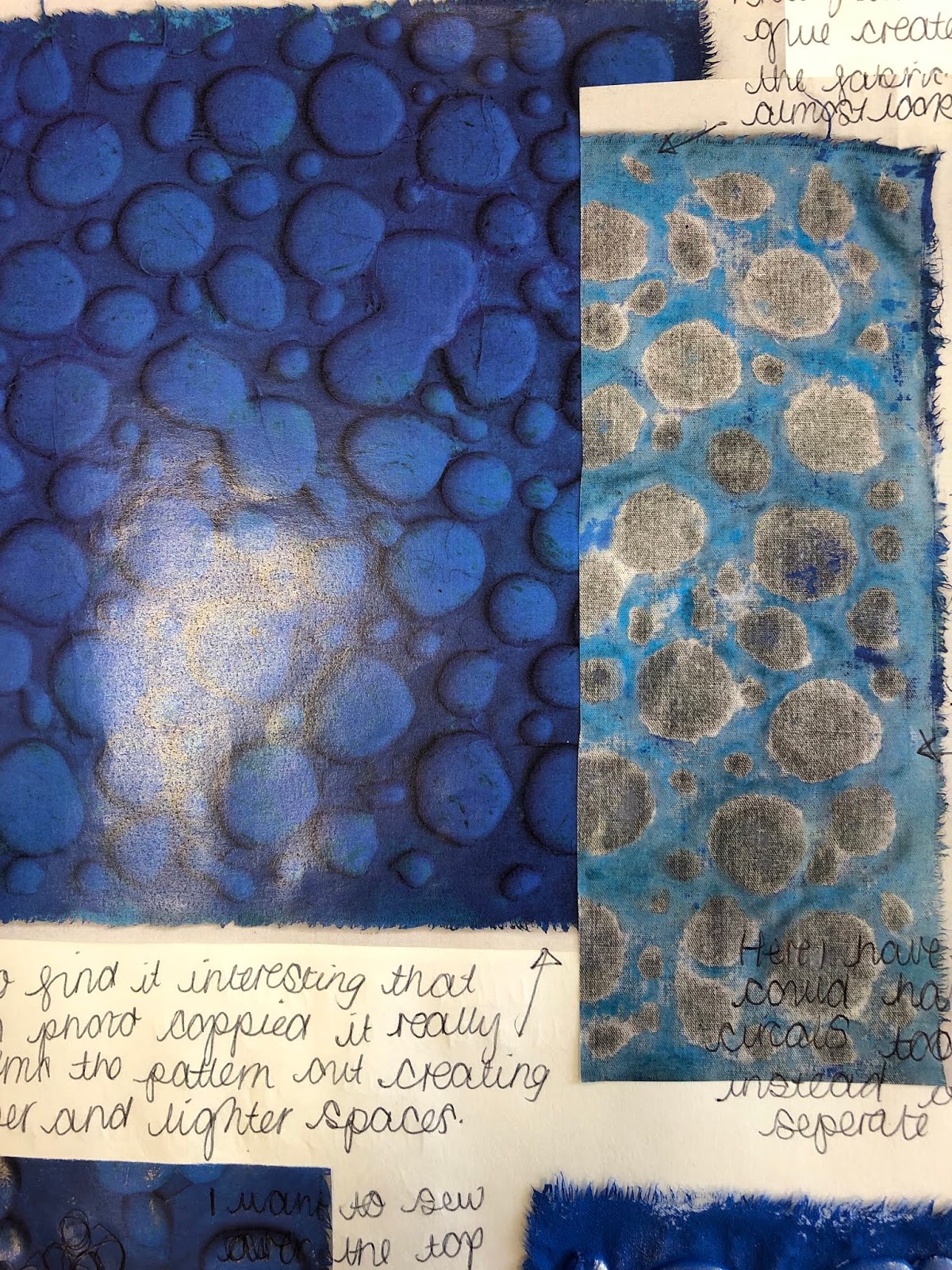
With this final fabic design I ended up creating two fabics, the first one was the hot glue onto the fabic and then I have painted over the top and I added treasure gold to make the texture stand out more. I like how the pattern stands out and almost looks like water drops.

This is my other fabic with this pattern, I chose to photocopy the fabric and then transfer it onto fabric and sew over the top using free machine embroidery. I really like how this has turned out as I think the stitching adds some detail to the pattern and shows the same pattern in a differnt scale which I think is very successful. I also like how the pattern photocopies flatterns out the design and makes it all into one layer.

For my last fabirc design I chose to paint onto differnt plastics and then layer them over the top to create the whole pattern. I wanted to transfer the pattern I did on the bondaweb to a differnt media. I looked at how I could add stitching over the top to add more detail and show the idea of positive and negative space with the white and black colours.
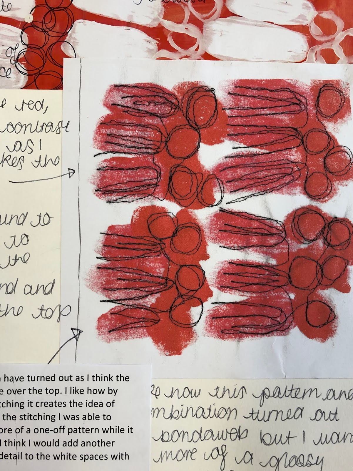
This is my final finished fabric design. I really like how this has turned out as I think the colours are really bright and make it stand out. As well I think having the contrast with the white, black and red shows the idea of positive and negative space in the pattern. I think the stitching over the top add a bit of detail to a simple pattern which I think it needed.

I hope you have enjoyed looking at my work and thank you for reading.
Amy xxx
Comments
Post a Comment